Bạn đang xem: Ielts model bar chart band score 9
Chú ý: Link download ở cuối bài viết.
The chart shows the average daily minimum and maximum levels of air pollutants in 4 cities 2000.
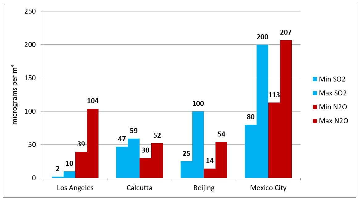
The given bar chart presents the daily minimum and maximum levels of SO2 and N2O which caused pollution in 4 different cities (Los Angeles, Calcutta, Beijing and Mexico City) in the year 2000. Overall, Mexico City was by far the most contaminated by the two mentioned pollutants among the four cities.
In Los Angeles, the quantity of SO2 emitted into the atmosphere was the lowest of all cities, with a minimum average of 2 micro-grams per m3 and a maximum average five times as much, at 10 micro-grams. The levels of N2O emissions weremuch higherwith the maximum daily average levelreaching up tomore than 100 micro-grams per m3. Meanwhile, the atmosphere in Mexico City wasseverely pollutedby SO2 and N2O emissions with the daily minimum and maximum averages of 80 and 113 micro-grams per m3 respectively.
In contrast to Los Angeles and Mexico City, the amount of pollution caused by N2O in Calcutta and Beijing was less than that caused by SO2.The daily average maximum figures forSO2 emissions were 59 micro-grams per m3 in Calcutta and 130 micro-grams per m3 in Beijing while the average maximum figures for N2O were just over 50 micro-grams per m3 in both cities.
Bài mẫu IELTS Writing Task 1 Bar Chart #02
The chart shows the proportion of renewable energy in total energy supply in 4 countries from 1997 to 2010.
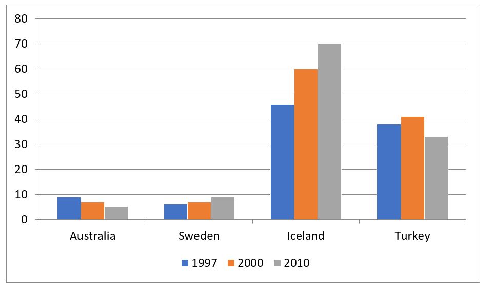
The given bar chart presents data about the percentages of renewable energy with regards to the total energy production in four different countries (Australia, Sweden, Iceland and Turkey) in three years; 1997, 2000 and 2010.
Overall, Sweden and Icelandwitnessed an upward trendin the use of renewable energy sources in the three examined years. It can also be seen that among the four countries, this type of energy wasmost popular in Iceland.
In 1997, almost half of the total energy produced in Iceland came from renewable resources. This figure continued to climb steadily to 60% in 2000 and more than 70% in 2010. Meanwhile, in 1997, only approximately 5% of the entire amount of energy produced wasgenerated from natural resourcesin Sweden, whoexperienced a similar trend to that of Icelandin regards to proportion of renewable energy produced.
Regarding Australia, nearly 10% of the energy supply was from renewable resources in 1997, and this figure decreased slightly to around 5% in 2010. Similarly, the percentage of renewable energy used in Turkey experienced a decline over the years from approximately 37% in 1997 down to just under 35% in 2010.
Bài mẫu IELTS Writing Task 1 Bar Chart #03
The chart below shows the number of films produced five countries in three years.
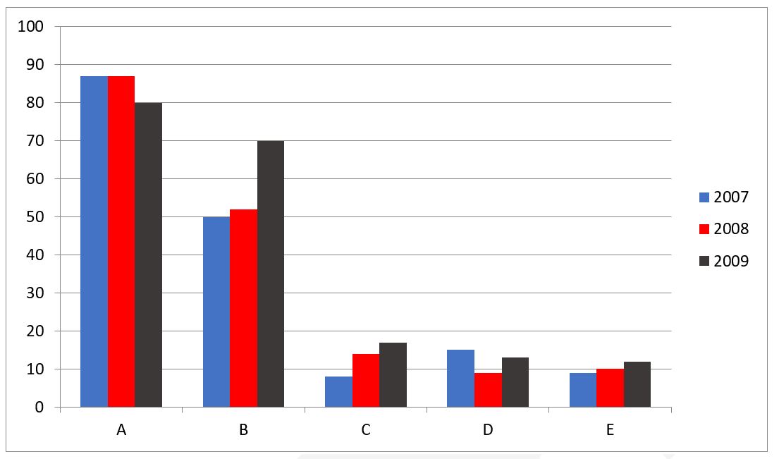
The bar chart provides information about movie production in five different countries (labelled A-E) from 2007 to 2009.
Overall, country A had the highest number of films produced. It is also notable that while there was a decline in the figures for country A and D, the opposite was true for those of country B, C and E.
In 2007, around 86 films were made by country A. The figure remained unchanged one year later before slightly decreasing to exactly 80 films in 2009. Starting at about 15 movies in 2007, the number of films released by country D fell to just under 10 in 2008 and rose again to 12 in 2009.
However, the opposite trend could be seen in the figures for the other countries. Between 2007 and 2009, the number of movies made by country B witnessed a rise of 20 movies from 50 films to 70 films. Similarly, despite standing at only under 10 films in 2007, the number of movies made by country C underwent a gradual increase to 18 movies by 2009. As for country E, the figure only experienced a minimal rise from around 9 movies in 2007 to 11 in 2009.
Bài mẫu IELTS Writing Task 1 Bar Chart #04
The bar chart below shows the percentage of government spending on roads and transport in 4 countries in the years 1990, 1995, 2000, 2005.
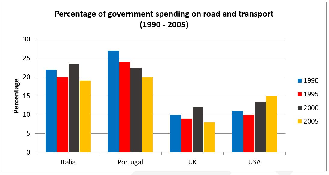
The given bar chart shows the proportion of government expenditure on road and transport in four countries (Italy, Portugal, UK, USA) every five years between 1990 and 2005.
Overall, it can be seen that governments in mainland Europe spent far more money on roads and transport than those in the UK and USA. It is also clear that the UK spent the least amount of money on roads and transport in all measured years.
In 1990, Portugal spent the most amount of money on roads and transport at approximately 27%, followed by Italy at about 22%, while the USA and UK both spent only around 10% of their government budget. In 1995 however, all countries reduced their road and transport spending by between 1-3%.
By 2000 while Portugal continued to reduce its road and transport spending down to around 22%, Italy had increased its spending to approximately 23%, overtaking Portugal as the leading spender on transport infrastructure in 2000. The UK and USA had both increased spending in 2000 by about 3%. In 2005, all countries except USA further reduced their spending with Portugal, Italy, UK and the USA at 20%, 19%, 8% and 15% respectively.
Bài mẫu IELTS Writing Task 1 – Bar Chart #05
The chart shows information about the actual and expected figures of population in three cities, Jakarta, Sao Paulo, and Shanghai.
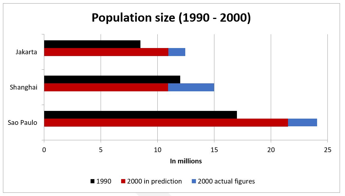
The given bar chart illustrates the population of Jakarta, Shanghai and Sao Paulo in 1990, as well as the estimated and actual figures of the populations in 2000.
Overall, the population figures were highest for Sao Paulo, while Jakarta had the lowest number of inhabitants. Also, there were significant differences in the predicted and actual figures for 2000 in all countries.
Starting at around 17 million people in 1990, the population of Sao Paulo, the most populous area of the three examined cities, was expected to rise by about 4 million over the next decade. Likewise, forecasts estimated that the figure for Jakarta would also experience an increase of 2 million to reach 11 million in 2000, while that of Shanghai would decrease slightly to 11 million people.
The actual figures, however, implied a considerable growth in the populations of all cities. To be specific, Sao Paulo’s population reached nearly 25 million after ten years, while there were about 3 million more residents in Jakarta. At the same time, Shanghai’s figure which was projected to decrease slightly turned out to soar to 15 million in 2000.
Bài mẫu IELTS Writing Task 1 Bar Chart #06
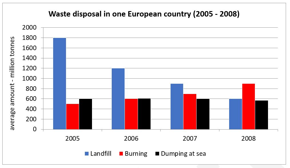
The bar chart details the amount of waste that was disposed via landfill, burning and dumping at sea, in a particular European country between 2005 and 2008.
Overall, it can be seen that while landfills initially were the main method of waste disposal and burning the least used method, the trend slowly reversed over the four-year period.
In 2005, disposing of waste via landfill was significantly the most preferred method of disposal with 1800 million tonnes of trash being buried. The amount of trash dumped at sea was only a third of this, at 600 million tonnes, while the amount of trash that was burnt was around 500 million tonnes. In 2006 the amount of waste buried in landfills had reduced substantially by 600 million tonnes, to 1200, however the amount of waste that was burnt or disposed of at sea only increased by 50-100 million tonnes.
In 2007, the waste the was buried and dumped at sea both dropped to about 900 and 600 million tonnes respectively, while the amount of trash burnt rose to around 700 million tonnes. By 2008, burning of waste was the preferred method of disposal, at 900 million tonnes, with landfill waste down to only 600 million tonnes, a third of the figure from four years earlier, and only approximately 550 million tonnes of waste dumped at sea.
Bài mẫu IELTS Writing Task 1 Bar Chart #07
The bar shows the percentage of people going to cinemas in one European country on different days.
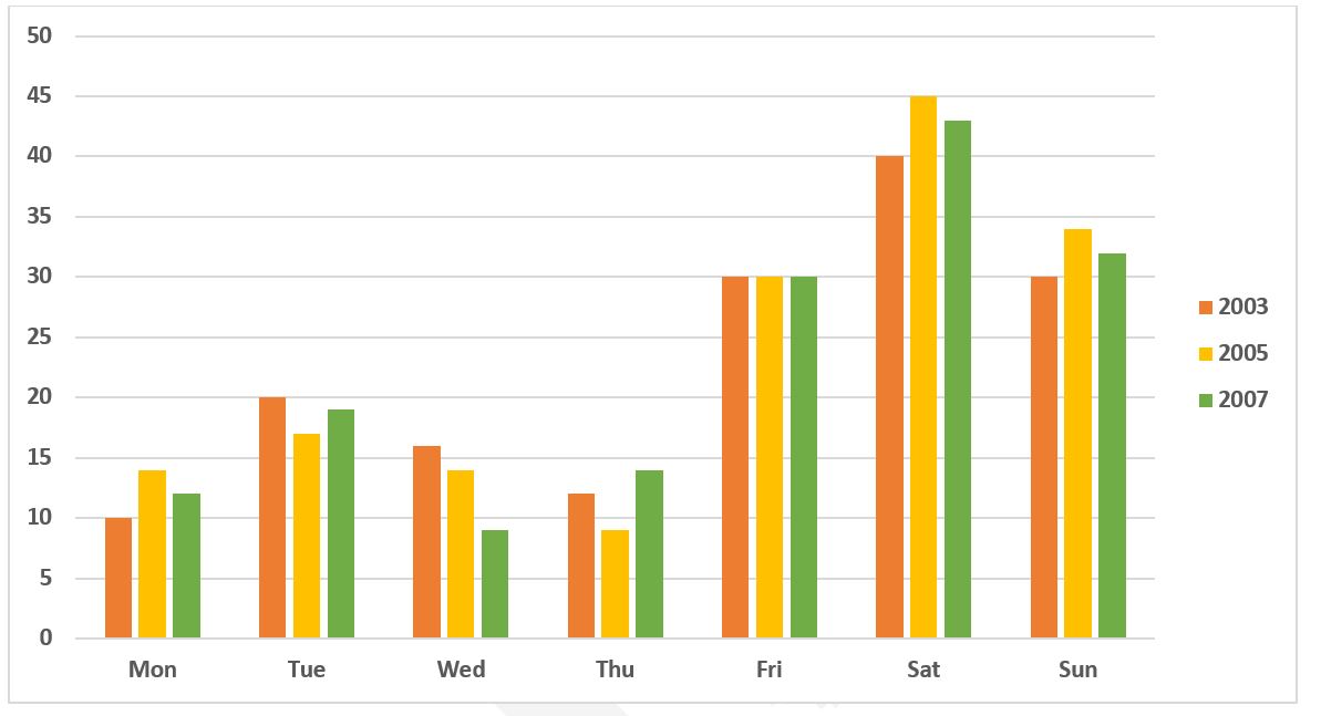
The chart illustrates the proportion of people visiting a cinema during seven days of the week in a European nation from 2003 to 2007.
It is clear that there were only small fluctuations in people’s preference of which day to go to the cinema over the examined period. People in this country tended to go to the cinema on the weekend rather than on Monday to Friday.
In 2003, 40% of people went to cinemas on a Saturday, compared to 30% on Friday or Sunday each. On the other days, the proportion of movie-goers was higher on Tuesday, at 20%, while the lowest figure can be seen on Monday, at only 10%.
Over the next four years, the percentage of people going to the cinema on weekends increased slightly to 45% 35% for Saturday and Sunday respectively. Similarly, Thursday and Monday became more popular among cinema-goers, with about 2% more people choosing these days. However, fewer people went to see movies on Tuesday and Wednesday, with the figures falling to 19% and 9% respectively. Finally, the proportion of movie-goers choosing to go to the cinema on a Friday remained at 30% during the three examined years.
Bài mẫu IELTS Writing Task 1 Bar Chart #08
The chart below shows the percentage of the population in the UK who consumed the recommended daily amount of fruit and vegetables in 2002, 2006 and 2010.
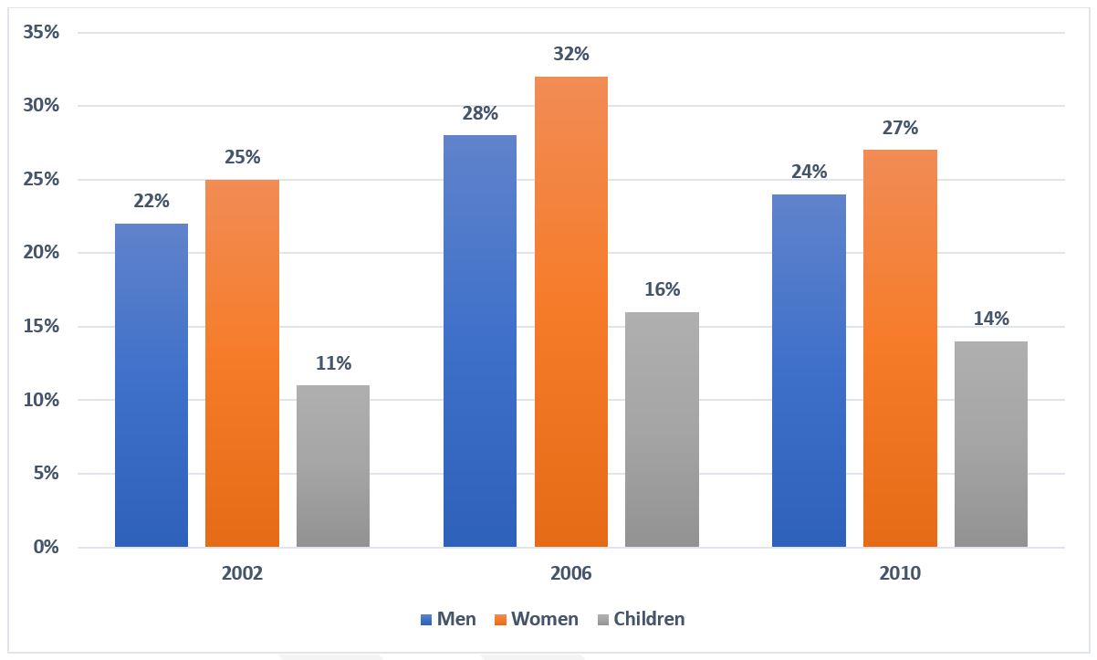
The chart illustrates the percentage of men, women and children who consumed the recommended amount of fruit and vegetables on a daily basis in three different years.
Overall, women came out first in term of fruit and vegetable consumption while the opposite was true for children.
In all three years, there was a small difference in the percentage of males and females who consumed enough fruit and vegetables every day. The highest figure for women was 32% in 2006 compared to 28% of men. 2010 witnessed the second highest rank for both women and men’s figures. While 27% of women consumed fruit and vegetables, the percentage of men was 24%. And the smallest figure for both women and men, which was nearly the same as the 2010 figures, was recorded in 2002.
Xem thêm: Mua Bán Realme X2 Pro Cũ Giá Rẻ Nguyên Seal, Mua Bán Realme X2 Pro Cũ Giá Rẻ
The smallest percentage of people consuming the daily recommended amount of fruit and vegetables was children with only 11% in 2002, half as much as that of men and women in the same year. Following that, the figure for children slightly increased to 16% in 2006 before falling marginally to 14% in the last year.
Tổng hợp bài mẫu IELTS Writing Task 1 dạng Bar Chart
Tải tổng hợp bài mẫu IELTS Writing Task 1 dạng Bar Chart tại đây